Plan Your Project
Bring this design into your kitchen.
Free 30-minute design consultation at our Boynton Beach showroom. See the slabs, talk through your kitchen, and get a real timeline + ballpark.
★★★★★ 5.0 · 559 Google reviews · Family-owned since 2008
The Design Logic Behind Two-Tone Kitchens
Two-tone kitchen design represents intentional visual hierarchy rather than random material mixing—the goal is creating focal points and depth through strategic contrast. The approach works by designating certain elements as primary (visually dominant) and others as secondary (supporting), typically with the island serving as the star attraction while perimeter counters play a supporting role. This technique has exploded in popularity across South Florida luxury homes over the past five years, appearing in approximately 45% of high-end kitchen renovations we've completed in Boca Raton, Wellington, and Palm Beach Gardens. The aesthetic sophistication lies in creating dialogue between materials without causing visual confusion—the two selections should relate to each other through either shared colors, complementary patterns, or unified undertones while providing sufficient contrast to justify the differentiation. Poor execution creates kitchens that feel chaotic and unresolved, with materials fighting for attention. Successful execution generates dynamic, layered spaces that reward closer inspection with design details that might initially go unnoticed. The fundamental rule is this: create enough contrast to make the differentiation purposeful, but maintain enough harmony to keep the space feeling cohesive rather than fragmented.
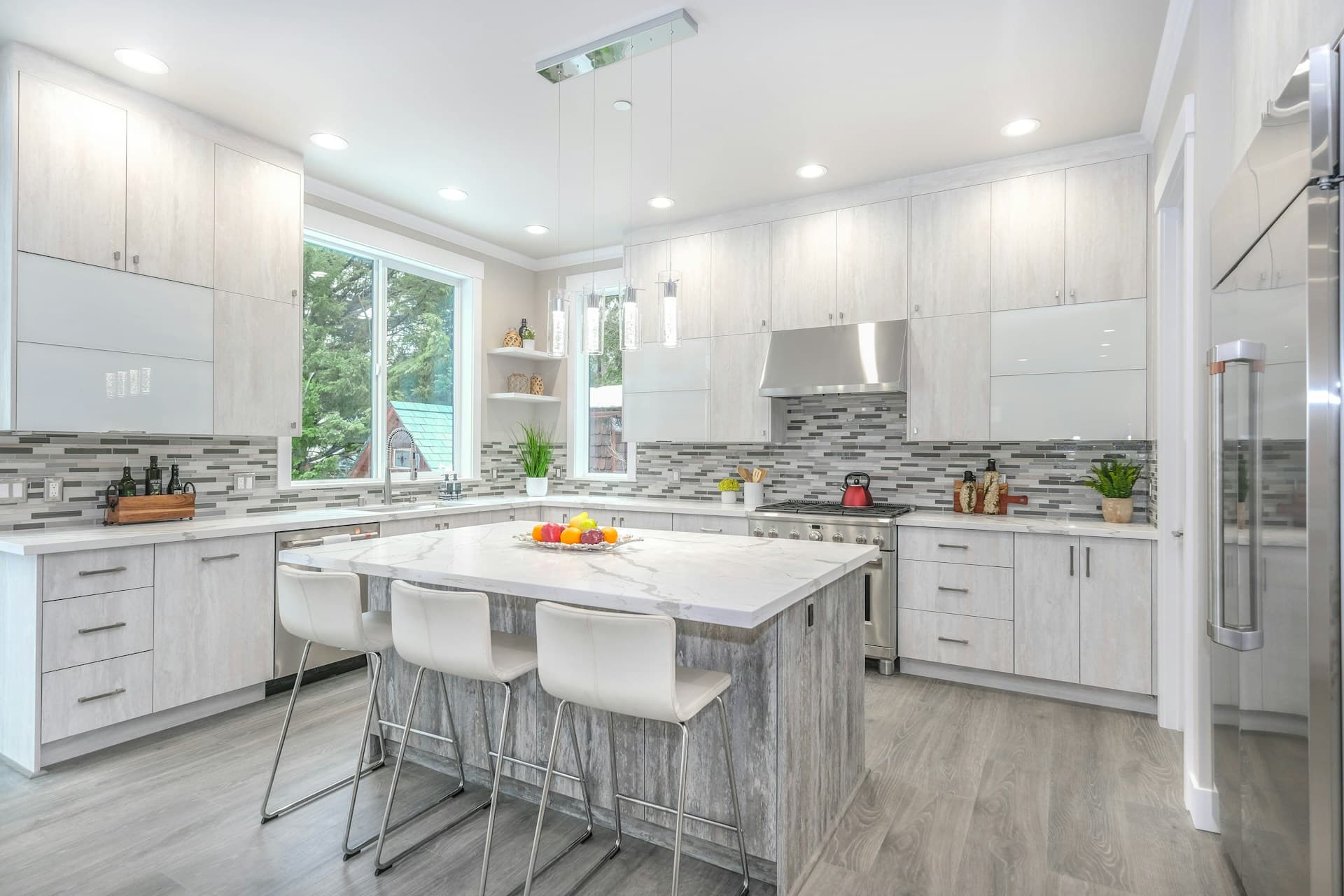
Classic Approach: Light Perimeter, Dark Island
The most common two-tone strategy places lighter countertops on perimeter cabinets with darker material on the island, creating a visual anchor that draws focus to the kitchen's social center. This approach works particularly well in South Florida's preference for light, airy spaces while introducing grounding contrast that prevents the kitchen from feeling washed-out. Popular combinations include White Princess quartzite perimeter with Cosmic Black granite island, Fantasy Brown quartzite perimeter with leathered Black Pearl granite island, or classic white Carrara marble perimeter with honed absolute black granite island. The light perimeter expands visual space and reflects abundant Florida sunlight, while the dark island creates substance and drama without overwhelming the room. This strategy also offers practical benefits; darker islands show fewer stains and water spots in high-use areas where families gather, cook, and entertain. The contrast principle extends beyond just color—mixing finishes amplifies the effect. Polished white quartzite on perimeter counters paired with leathered or honed dark granite on the island creates textural interest alongside color contrast. For maintaining cohesion, ensure the two materials share at least one characteristic: if both have visible veining, or both are solid with minimal pattern, the relationship feels intentional rather than arbitrary.
Free Estimate
Want to see what this looks like in your kitchen?
500+ slabs in our Boynton Beach showroom. Get a quick estimate or book a private viewing.
Sophisticated Variation: Same Material, Different Colors
A more subtle two-tone approach uses the same material type in different colors, creating sophisticated unity with gentle contrast. This strategy is particularly effective with engineered quartz, where manufacturers offer coordinated color families that share undertones and veining patterns while varying in value (lightness/darkness). For example, Cambria's Brittanicca on perimeter counters with Cambria's Montgomery on the island provides tonal variation within a cohesive palette—both feature similar gray-white backgrounds with coordinating vein patterns, but Montgomery introduces more dramatic darks. Similarly, pairing light quartzite like White Macaubas on perimeter with medium-toned quartzite like Taj Mahal on the island creates warmth progression without jarring contrast. This approach offers several advantages: simplified slab selection since you're working with one material category, predictable maintenance requirements since both materials need identical care, and seamless aesthetic flow since pattern language remains consistent. The strategy works beautifully in transitional kitchens popular throughout Delray Beach and Boca Raton, where homeowners seek contemporary freshness without stark modern contrasts. To maximize success, select materials from the same color temperature family—all warm undertones or all cool undertones—avoiding the visual confusion of mixing warm and cool within one space.
Bold Strategy: Contrasting Materials and Colors
The most dramatic two-tone approach mixes not just colors but material types, creating maximum visual interest through contrasting characteristics. Popular combinations include Calacatta marble perimeter with Blue Bahia exotic granite island, White Macaubas quartzite perimeter with butcher block island, or Taj Mahal quartzite perimeter with leathered Black Marinace granite island. This strategy requires confident design execution—the materials must be sufficiently different to justify the mixing while sharing enough aesthetic DNA to feel purposeful. Successful execution often involves a unifying element: cabinetry color that complements both materials, a backsplash that incorporates colors from both countertops, or hardware finish that bridges the material divide. In our Wellington and Palm Beach high-end installations, we've seen stunning examples where contrasting materials create gallery-like sophistication. One recent project paired book-matched Calacatta Gold quartzite on the island with solid honed black granite perimeter—the ornate marble-look island became sculptural art against the quiet black frame. The risks involve overwhelming visual complexity, especially in smaller kitchens where too many competing elements create chaos. This approach works best in open-concept spaces with 300+ square feet where physical distance allows each material its own zone of influence.
Mixing Finishes: Polished, Honed, and Leathered
Surface finish presents another dimension of two-tone design beyond color and material type. Mixing polished and honed finishes of the same stone creates subtle sophistication—polished perimeter counters for easy cleaning paired with honed island for a softer, more tactile quality. Leathered finishes introduce texture that contrasts beautifully with polished or honed surfaces; a polished white quartzite perimeter with leathered black granite island creates both visual and tactile variation. Each finish type offers distinct characteristics: polished surfaces show color and veining most dramatically but reveal water spots and fingerprints more readily, honed finishes provide matte elegance with slightly more stain vulnerability in natural stone, and leathered finishes offer dimensional texture that hides imperfections while requiring more detailed cleaning. In South Florida's casual-elegant design aesthetic, mixing finishes allows personalization within material choices. Some clients love the high-gloss glamour of polished stone on display at their island, while preferring the understated sophistication of honed material on working perimeter counters. The practical benefits of mixing finishes shouldn't be overlooked—placing more maintenance-forgiving finishes in high-use areas while reserving finicky materials for lower-traffic zones balances aesthetics with livability. When mixing finishes, ensure the same material type appears in both finishes to maintain cohesion, or use different materials with similar color palettes to create intentional rather than accidental variety.
Budget-Conscious Two-Tone Strategies
Two-tone design doesn't require two luxury materials—strategic mixing can actually reduce costs by reserving premium stone for focal areas while using more affordable options elsewhere. A popular budget-smart approach places exotic quartzite or imported marble exclusively on the island (typically 20-30 square feet) while using mid-range granite or quartz on perimeter counters (typically 40-60 square feet). For example, splurging on Calacatta Gold quartzite for your island while using standard granite for the perimeter delivers luxury aesthetic with controlled budget—the blended cost is significantly less than using premium stone throughout. Another cost-effective strategy uses remnants for smaller elements; if your island is compact (15-20 square feet), a premium remnant piece can provide luxury material at 40-50% savings. Some homeowners mix natural stone on focal surfaces with engineered quartz on working surfaces, balancing aesthetics with maintenance convenience and budget constraints. The key is ensuring the differentiation feels intentional; using premium material in one small, seemingly random location appears budget-driven rather than design-driven. Concentrate your investment where it creates maximum impact—typically the island—and choose complementary but more affordable materials for supporting roles.
Design Your Two-Tone Kitchen with Expert Guidance
Successfully executing two-tone design requires experience visualizing how materials interact across real spaces—something that's difficult to assess through samples alone. Our Boynton Beach showroom allows side-by-side comparison of materials under various lighting conditions, helping you evaluate contrasts and harmonies before committing. We provide digital rendering services showing your selected materials in your actual kitchen layout, eliminating guesswork about whether combinations will achieve your aesthetic vision. Our design team has extensive experience guiding clients through two-tone decisions, understanding which pairings create sophisticated contrast versus visual confusion. We maintain a portfolio of completed two-tone installations throughout Palm Beach County that demonstrate various strategies: light-dark contrast, same-material color variations, mixed-material approaches, and finish mixing. These real-world examples provide inspiration and realistic expectations about how different approaches perform in finished spaces. Ready to explore two-tone options for your kitchen? Schedule a design appointment at countertopspalmbeach.com/book-viewing where we'll discuss your aesthetic preferences, budget parameters, and functional requirements. Use our online estimator at countertopspalmbeach.com/estimator to receive preliminary pricing for two-tone configurations. Create the layered, sophisticated kitchen that elevates your home's entire aesthetic.